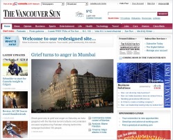
We relaunched vancouversun.com today after a few months of collaboration, negotiation, reconsideration and all of the usual processes that go into a large project and a healthy number of smart people.
Our last design was 2005, another era or two ago. Since then we've brought the site wholly into the newsroom and changed the culture to reflect our increasing emphasis in the digital sphere.
Quite important to us in the design changes were a few principles:
1. We wanted a wider tableau.
2. We wanted more legible and friendly body type.
3. We wanted plenty of space for multimedia, community content, and special features.
4. We wanted better navigation.
5. We wanted more ways for users to share our content.
We were creating a lot of content but didn't have the platform to exhibit it. Our journalists operate in a Web-first culture and wanted a site of their own making. Now we have one.
The redesign was chain-wide and you'll notice other Canwest publications have adopted variations on this wireframe. We were very pleased that our initial proposal looked strikingly similar to what we rolled out today, so we weren't far off our instincts on what users would want (the site has been tested extensively).

